This is a tech blog post in the afterglow of Frontend Developer Love Conference 2020. It is part of a blog series.

The word “a11y” might ring a bell if you ever went on twitter or other social media channels that talk about tech on the internet. It’s an abbreviation for “accessibility”, which is a shorter way to write it online. But what is accessibility? Accessibility means the ability of everyone, regardless of their disabilities, having access to something we make available, whether that’s websites or something else. It’s not something that can be opted out from. And in that context, we need to write applications that can be used by anyone and anywhere in this world.
That’s where the Web Content Accessibility Guidelines (WCAG) come in. These are the set of standards that exist, and that we should follow, to make our websites accessible. Our applications can range between different success criteria, going from A to AAA. Depending on whether your application is accessible or not in any given situation, double A meaning that you have taken care of accessibility in general and triple A meaning the website is accessible in any given situation. In Europe, companies must make their website at least to the double A level if they want to be conform with the rules.

Why does a11y matter?
You might wonder why you should worry about making your websites more accessible to its users? Well, first of all, anyone should be able to use your applications, regardless of their gender, age or disabilities. But most of all, 1 out of 10 users will have some disabilities which you might not expect and it might be surprising to hear that people are actually browsing the web using a straw and nothing else.

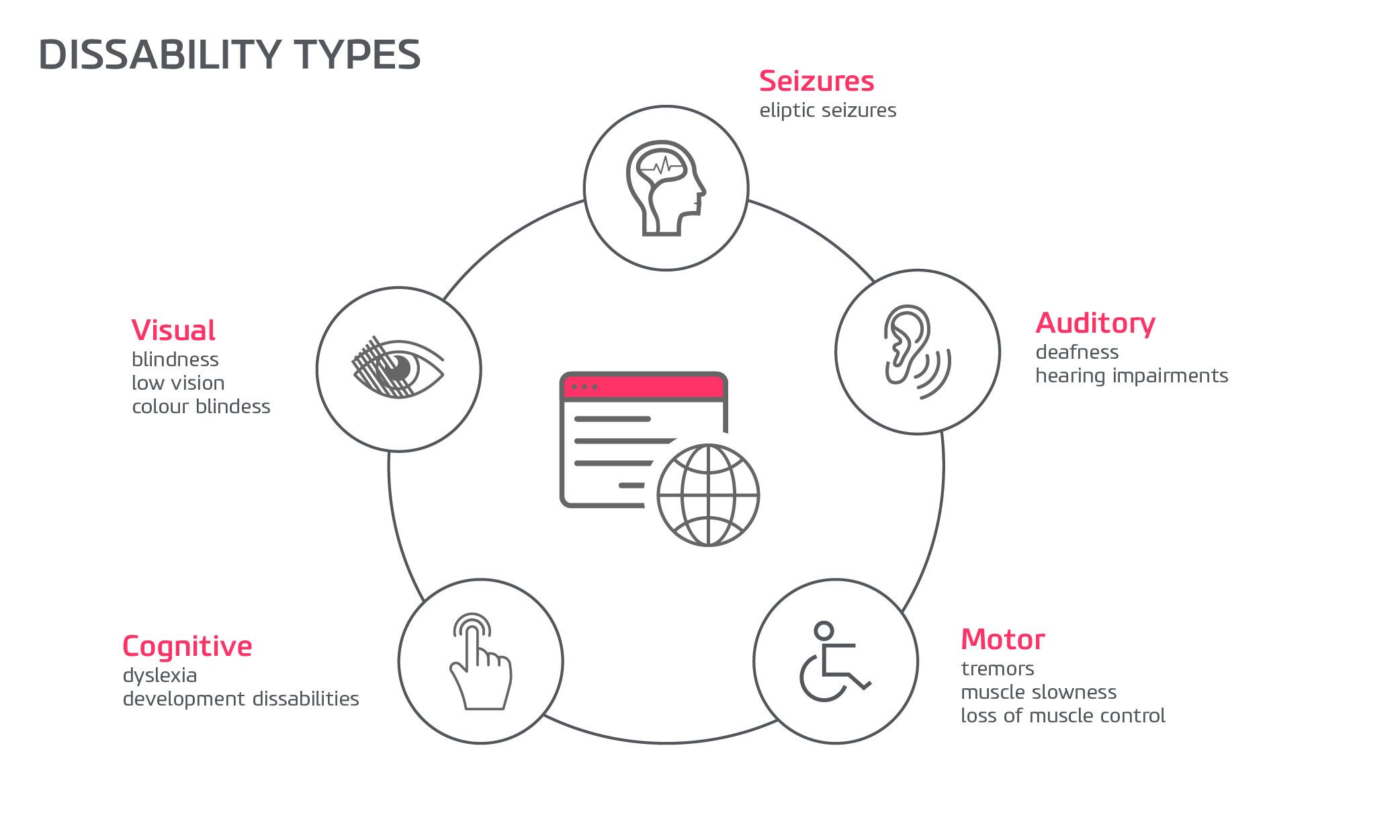
The view we have on disabilities goes beyond blind users, your users can use a screen reader to access your website but not only that as there is a huge variety of disabilities.
Your users can fall into any of the categories from the diagram above, they can have visual impairment, physical impairment or someone who has a cognitive learning disability such as dyslexia. So, taking all of them into account isn’t such a bad idea if you consider all the potential users you’re leaving behind. It also depends on the context, imagine a situation where you would break an arm? The situation would probably be easier if you could navigate more easily on the web.
Principles of a11y
Accessibility revolves around the following principles, which are referred to as POUR. POUR is an acronym for four high-level principles that describe functional accessibility. Accessible technology is Perceivable, Operable, Understandable, and Robust.
In addition to websites, most other information technology can be made accessible by applying the POUR principles. Many of the technological challenges faced by people with disabilities can be described by using one of the POUR principles.
Perceivable
Perceivability means the user can identify content and interface elements by means of the senses. For many users, this means perceiving a system primarily visually, while for others, perceivability may be a matter of sound or touch.
Operable
Operability means that a user can successfully use controls, buttons, navigation, and other necessary interactive elements. For many users, this means identifying an interface control visually, and then clicking, tapping, or swiping. For other users, using a computer keyboard or voice commands may be the only means by which they can operate and control the interface.
Understandable
Understandable technology is consistent in its presentation and format, predictable in its design and usage patterns, concise, multimodal, and appropriate to the audience in its voice and tone. Users should be able to comprehend the content and learn and remember how to use the interface.
Robust
Robust and designed to function on all appropriate technologies. Users should be able to choose the technology they use to interact with websites, online documents, multimedia, and other information formats.
The POUR principles were developed to describe web accessibility, but can be applied to almost any accessibility question. We as developers must ensure that our all users can perceive, operate, and understand the applications we make available, and that they are robust enough to work across a spectrum of technologies, including assistive technology.
Some tips on how to develop more accessible applications
Add Alt text to your images
Adding alt text for images is a quick win for accessibility. The text acts as a replacement for the image if it fails to load, giving an alternative text to the image helps users who work with screen readers. The screen readers will read the alt text and provide the information to the non-sighted users.
Your text should always answer this question: what is the content conveyed by the image?
Make forms accessible
Building forms is hard but making them accessible is not impossible. Filling forms on websites and apps for people with disabilities, and even for people without disabilities, should be painless.
Don’t forget to use native HTML elements, for instance, remember to use buttons and not divs everywhere.
Here is a link where you will find more information about the subject.
Ensure your application is keyboard-accessible
The most important goal of keyboard accessibility is to have your elements, such as links and form controls, available with the Tab key. This is how users that can only use the keyboard navigate through your pages. Testing your website for keyboard accessibility is easy: just press the Tab key and navigate from the top of the page to the bottom, highlighting active elements as you go. If you cannot navigate through the page like that then you might have an issue.
Use colour with care
The colour contrast between background and foreground content should be great enough to ensure that the content is readable.
There are several tools you can use to evaluate colour contrast, which will assist you in making your page as visually usable as possible to individuals with low vision or varying levels of colour blindness.
Make your dynamic content more accessible
When a SPA updates, for example without a page refresh, screen readers may not be aware of what’s happening on the page. This includes screen overlays, in-page updates, pop ups and modal dialogs. So, issues may arise and users that only use the keyboard might be trapped in page overlays.
Some tools and resources are:
- WebAIM
- Inclusive Components
- Axe – Web Accessibility Testing
- “I Used The Web For A Day With Just A Keyboard”
All in all, accessibility will become a bigger topic in the future so we should make it a priority for our future users to make them accessible. This article only scrapes the surface of making your applications accessible and I hope it will make you do your research on how to make them more accessible to your own audience.
